Beverage Showcase /
Beverage Showcase /
Brand World + Visual Identity
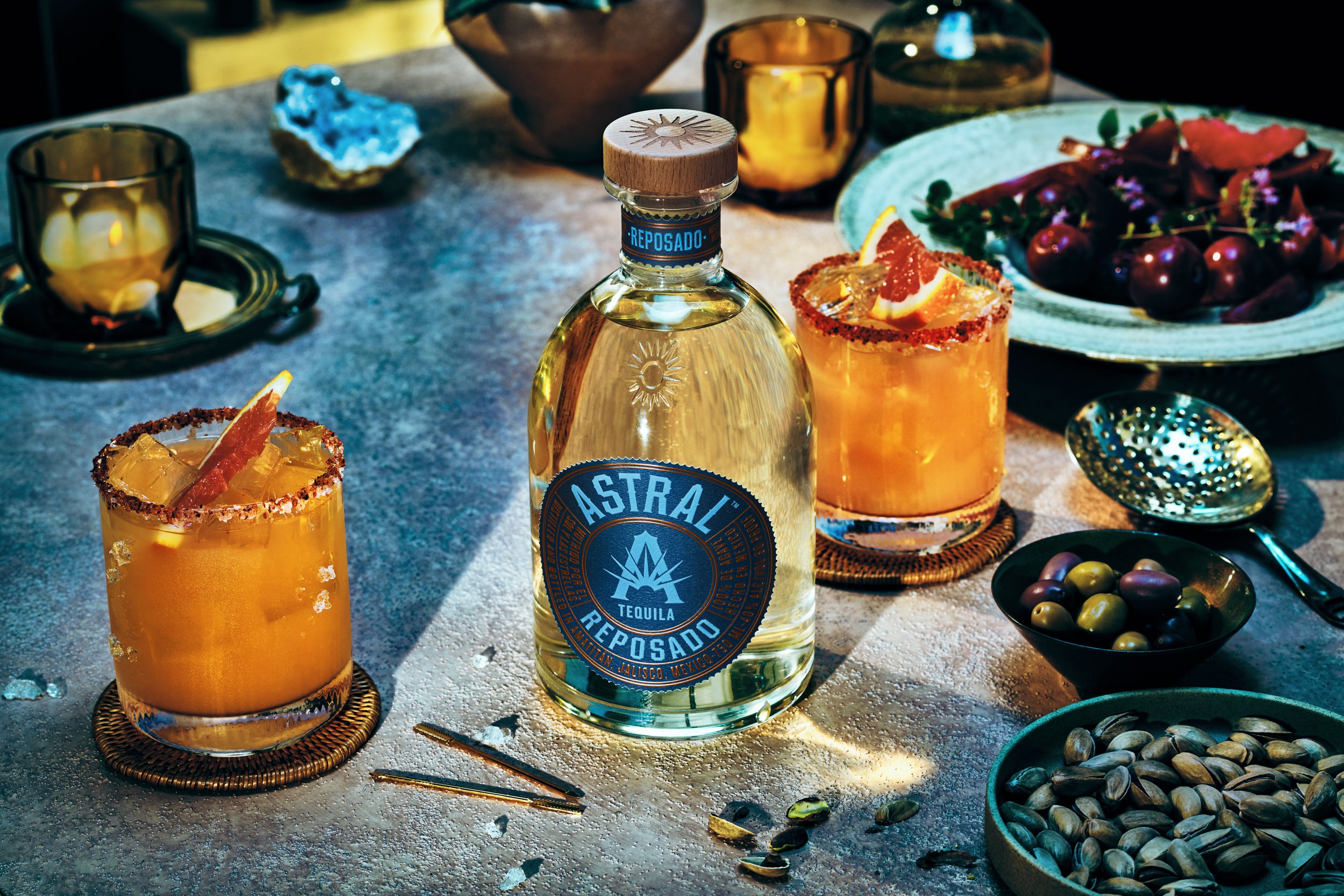
Astral Tequila
Comprehensive brand world and visual identity system for Astral Tequila, demonstrating the power of transformative storytelling in revitalizing an existing brand. This project goes beyond the packaging and logo design, but rather reimagining every touchpoint to craft a fully immersive brand experience. Through strategic design, rich narratives, and cohesive visual elements, Astral Tequila’s identity is brought to life in a way that deepens consumer connection and elevates the brand’s presence in the market.
Photography Studio: PEDEN+MUNK



Brand World + Visual Identity
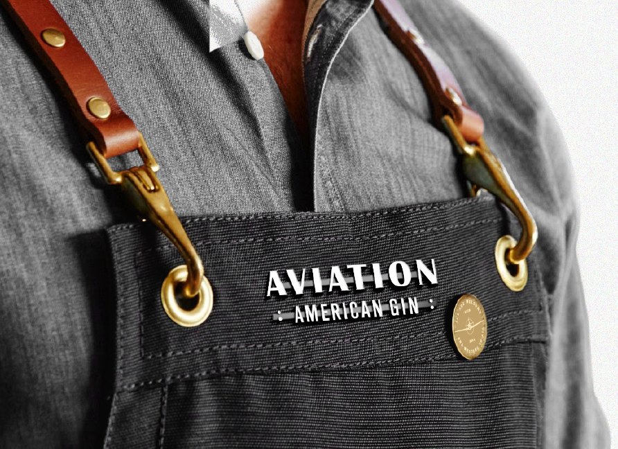
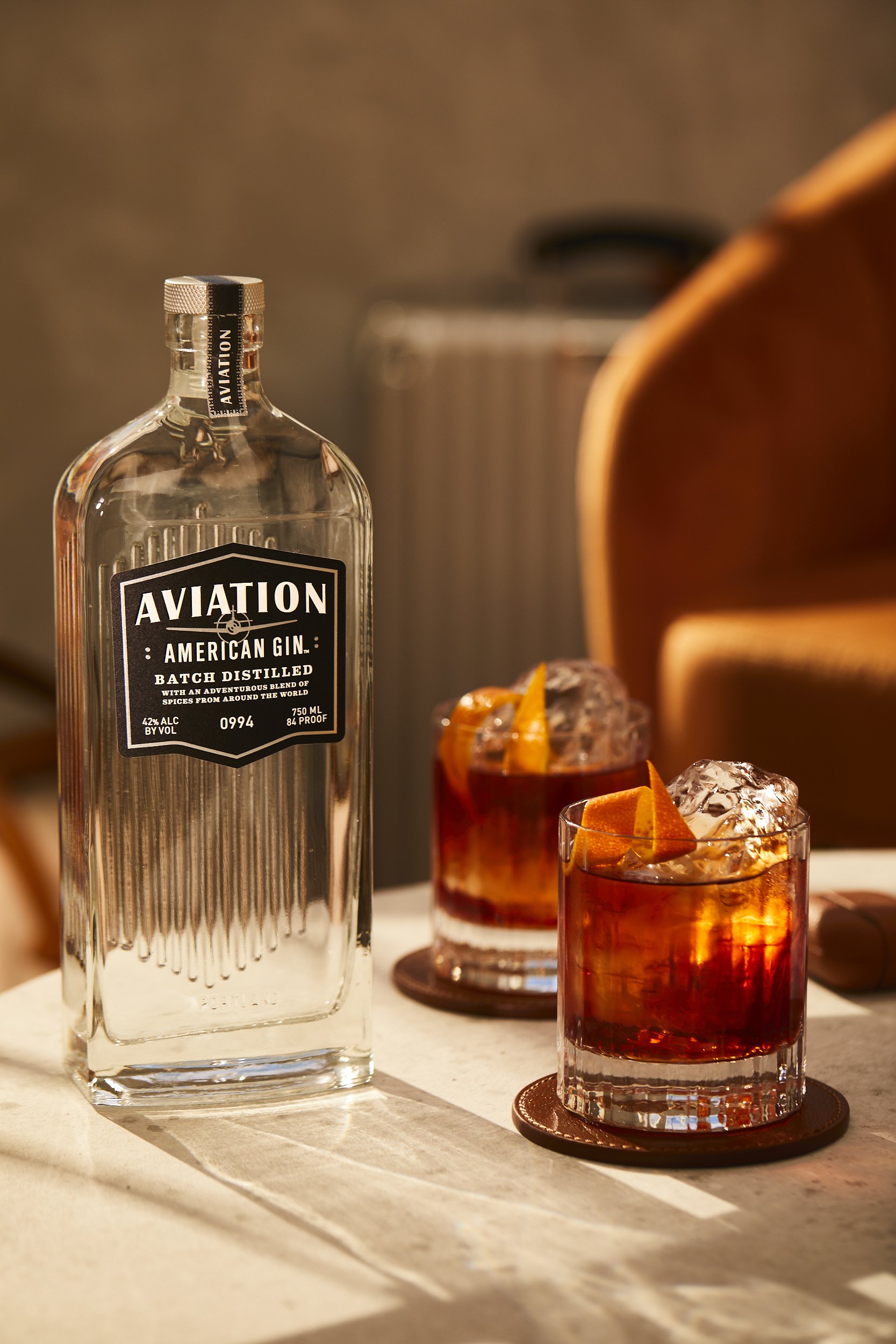
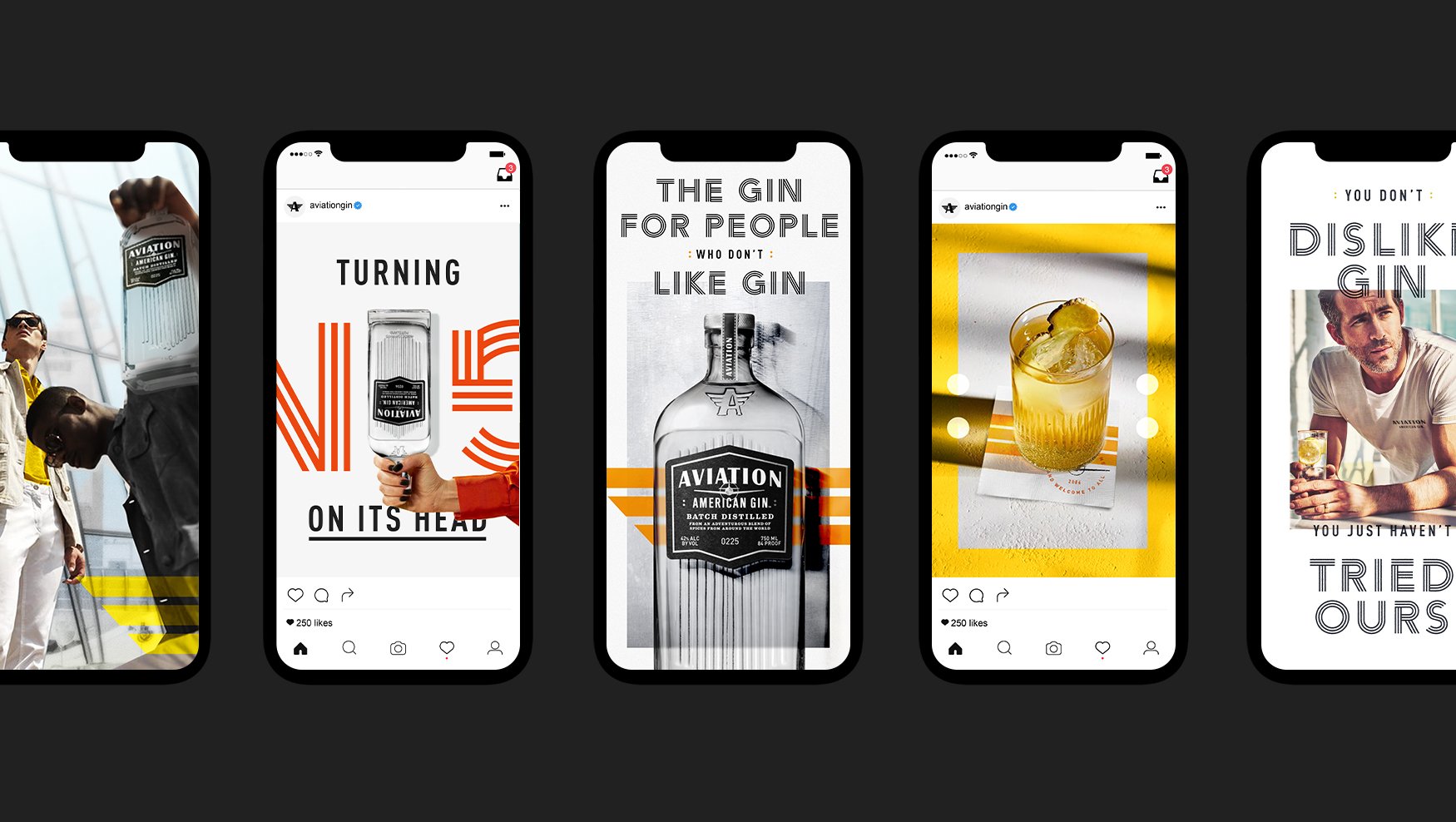
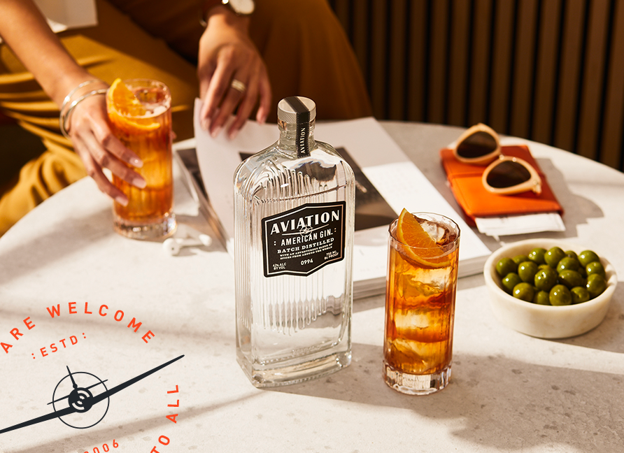
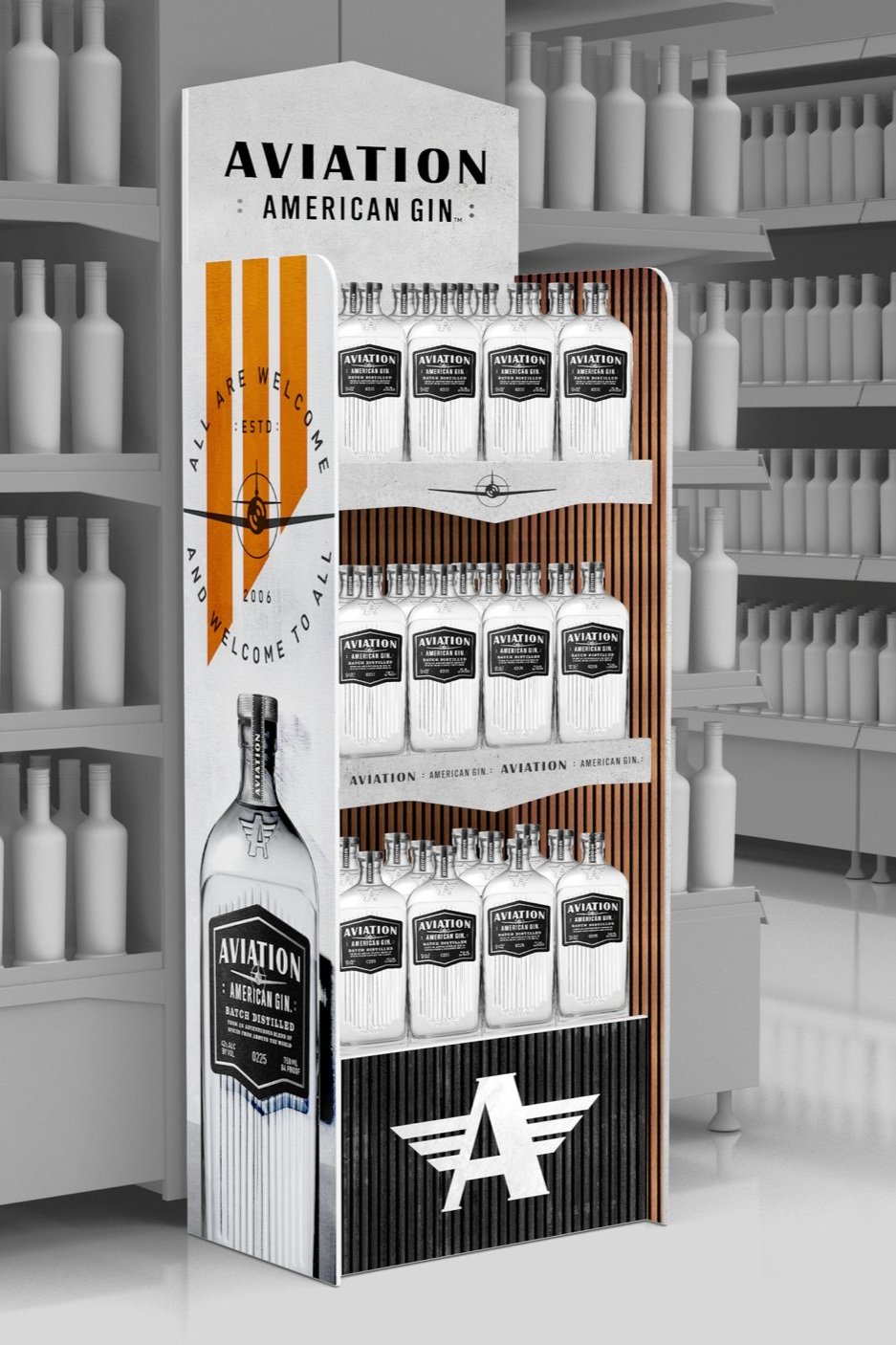
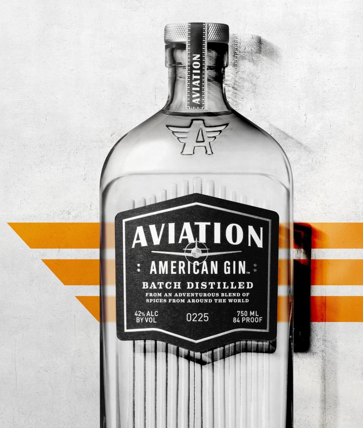
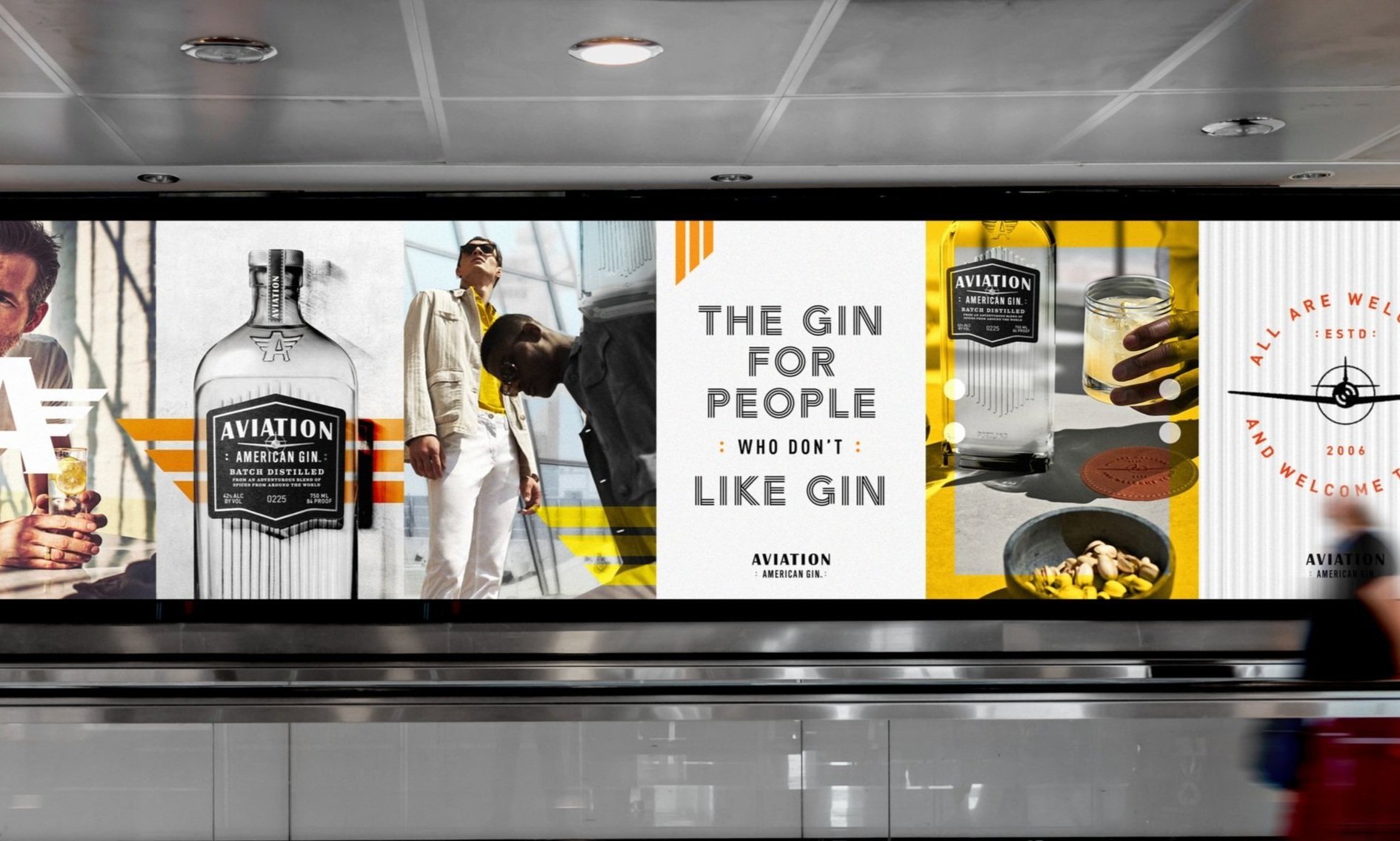
Aviation Gin
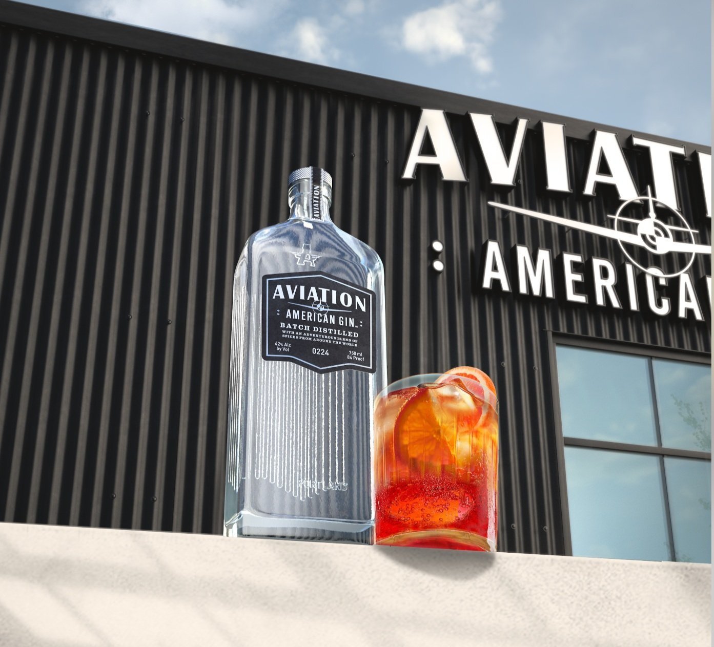
Fully realized brand world and visual identity system for Aviation American Gin, showcasing the impact of redefining an established brand to breathe new life into it. Going beyond packaging and branding by reimagining every interaction to craft a truly immersive brand experience. Through intentional design, compelling narratives, and a cohesive visual language, Aviation Gin’s identity is elevated—deepening consumer engagement and reinforcing its presence in the market.
Photographer: Rob Lawson



Limited Edition Packaging
johnnie walker
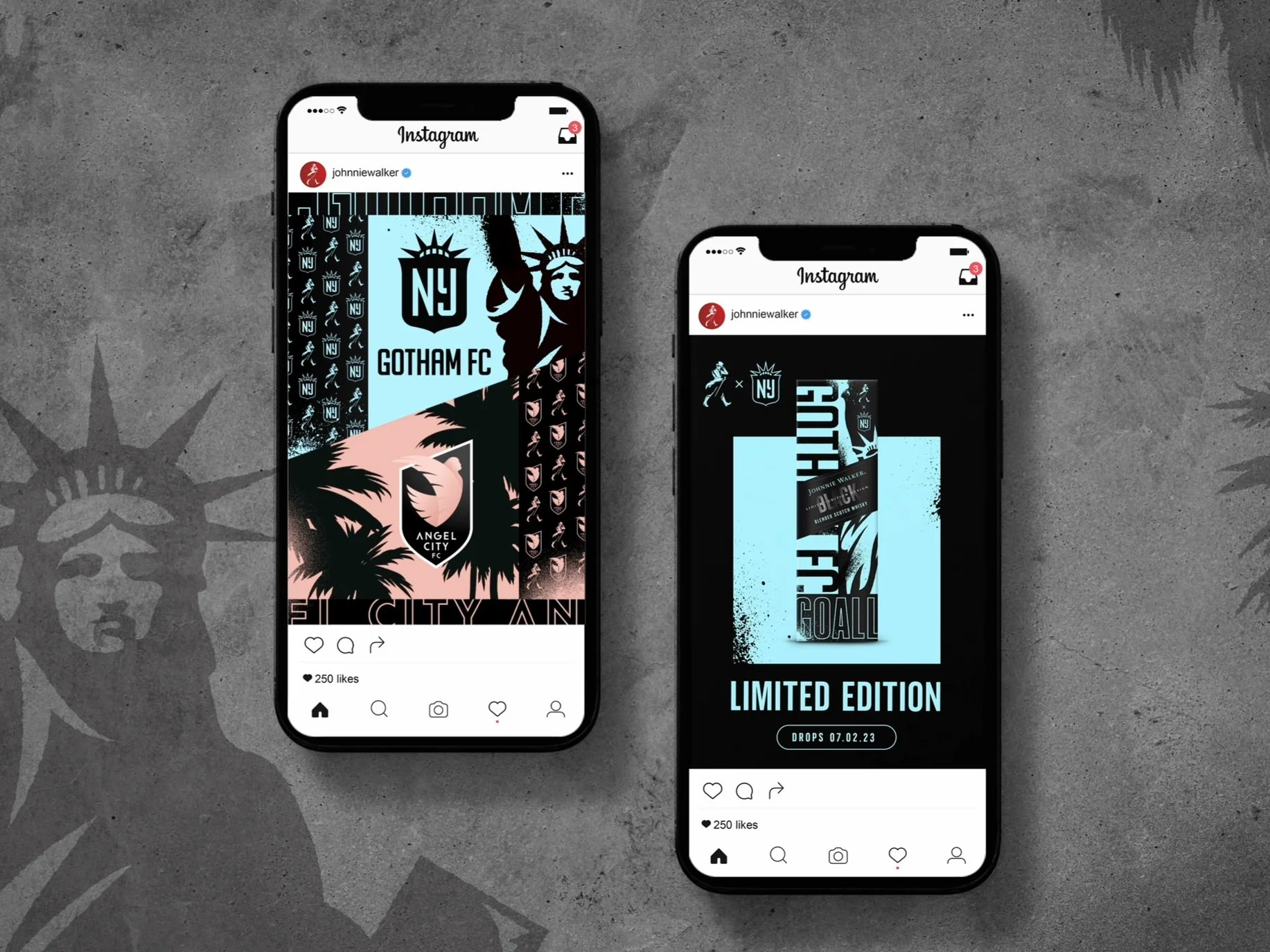
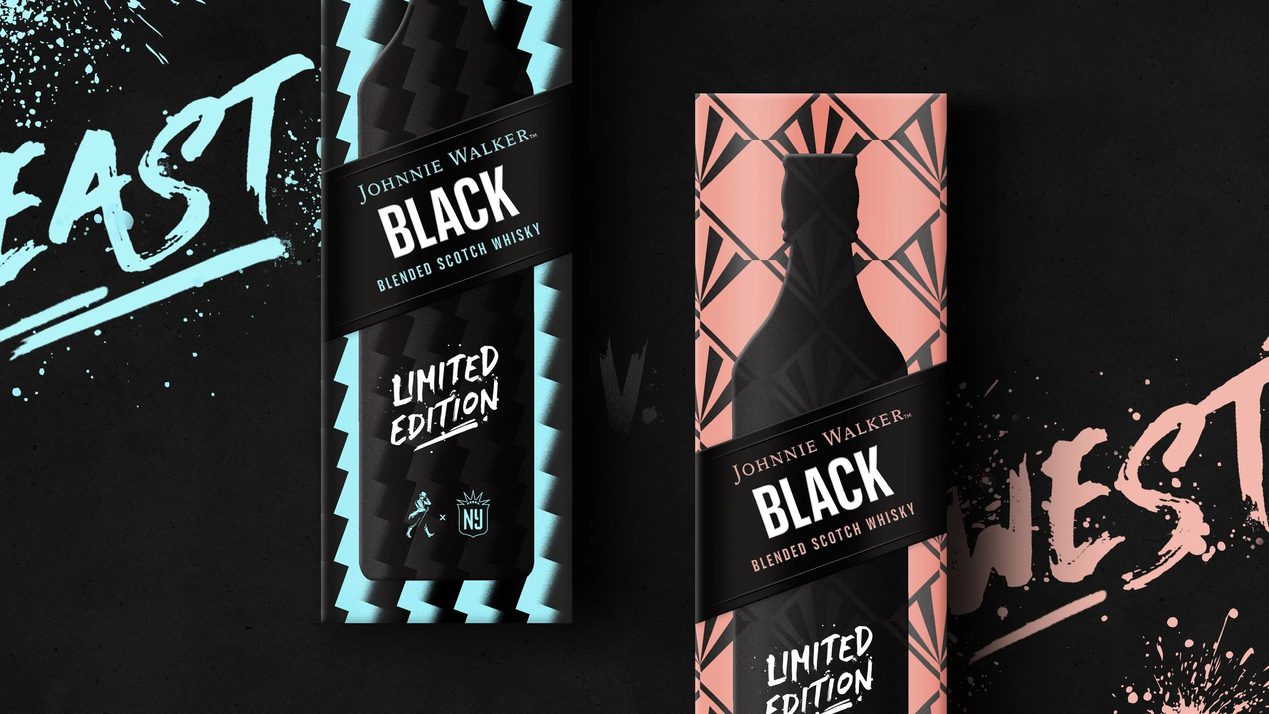
As a longtime champion of women’s sports, Johnnie Walker is reigniting a sense of passion for the game through their promotion of the Johnnie Walker Cup. In the Clash of The Coasts matchup, Gotham City FC and Angel City FC will go head to head. To drive recognition and excitement to the matchup, Johnnie Walker is celebrating each team both on and off shelf with a Limited Edition experience with their signature Black Label liquid. The following conceptual packaging exploration celebrates the partnership, each in their own unique way — from capturing the energy that radiates from the heart of every team, to the iconicity of each team’s kits, to leaning in to each coast’s locale — all in a way that feels undeniably Johnnie Walker.




Brand World + Visual Identity
crown royal
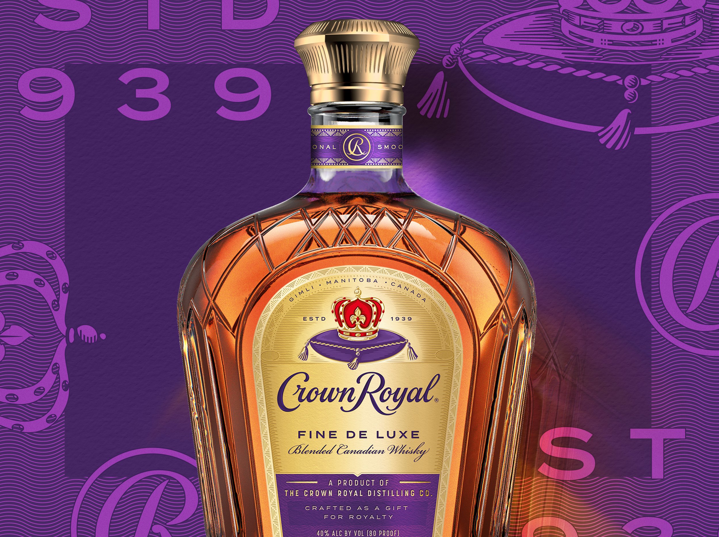
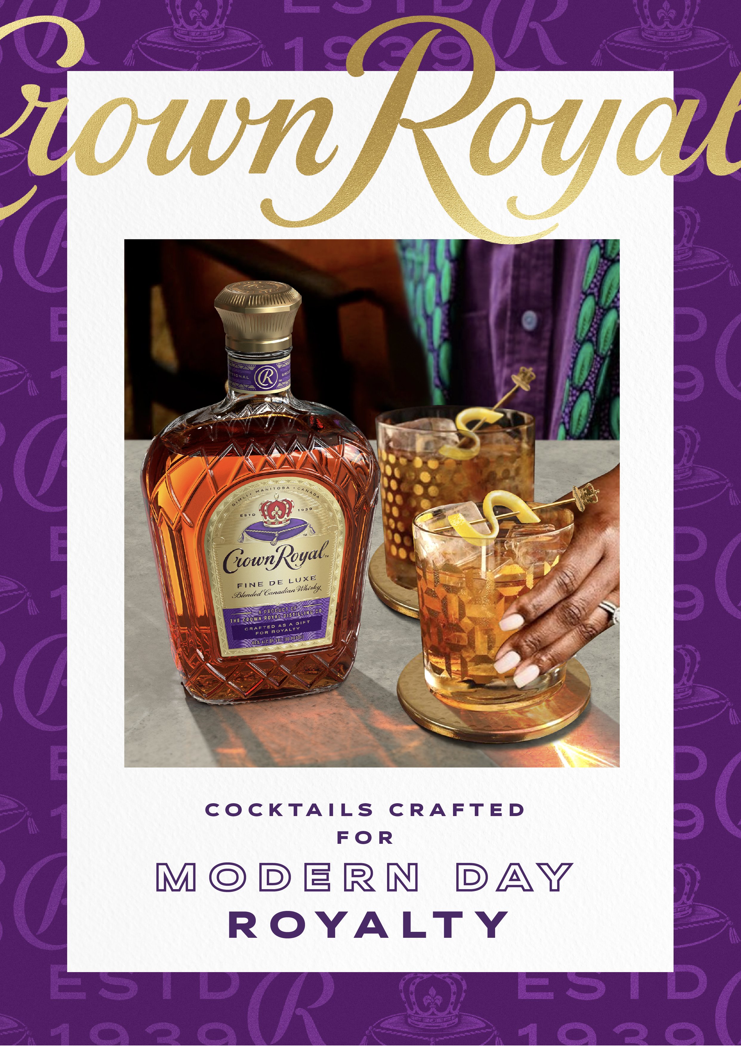
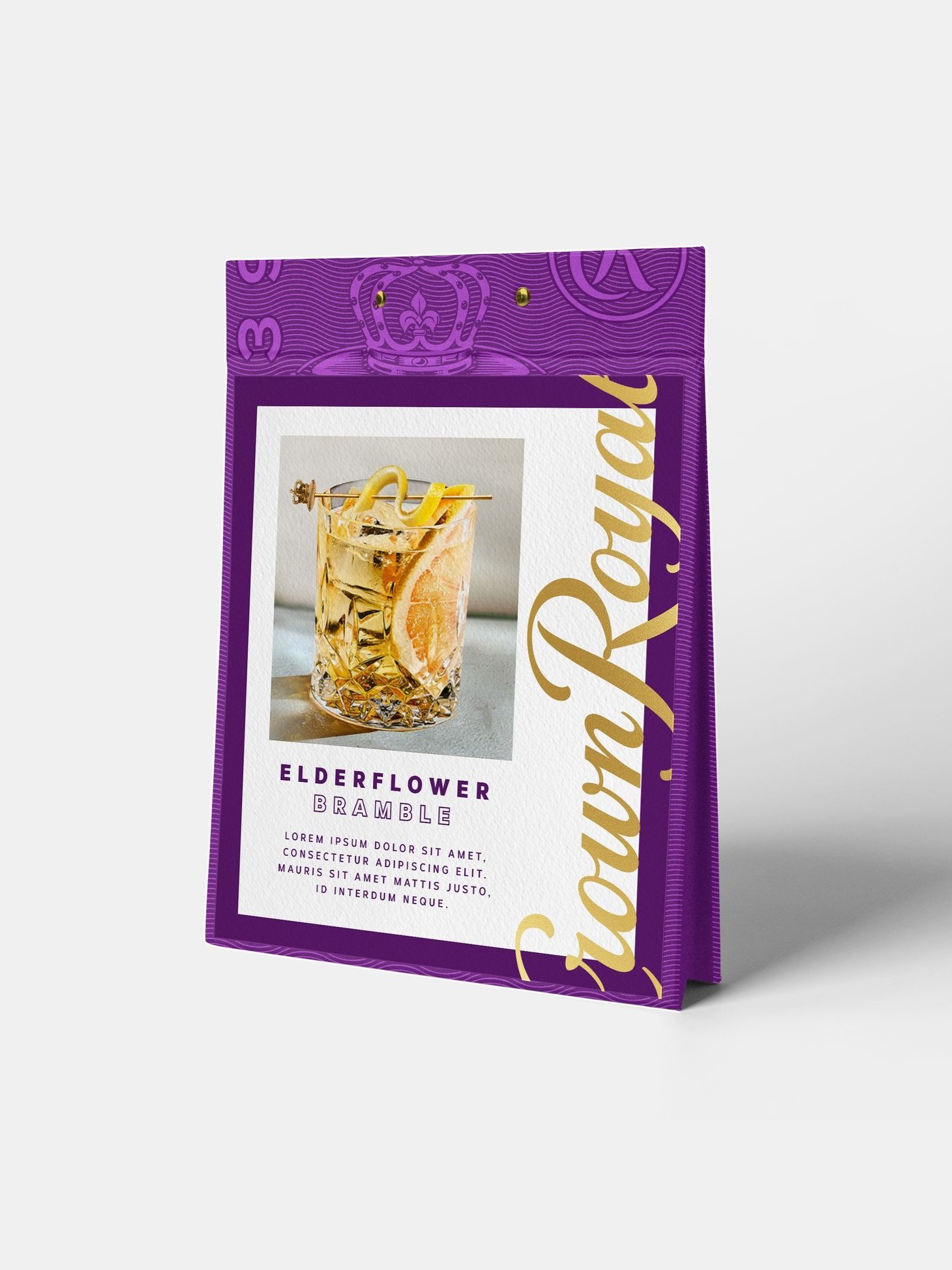
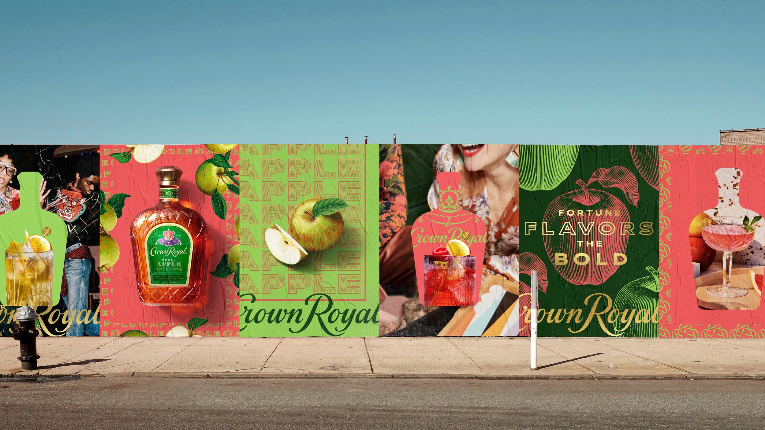
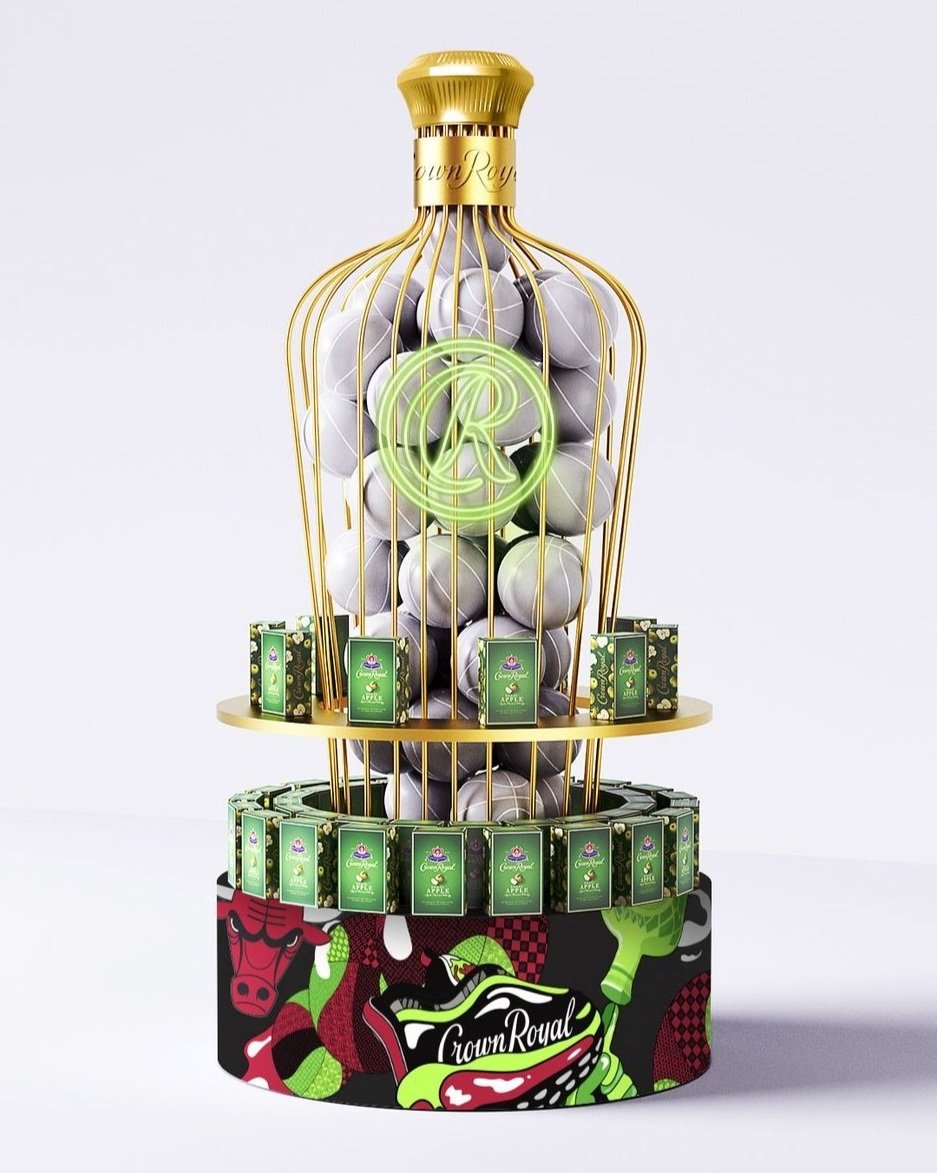
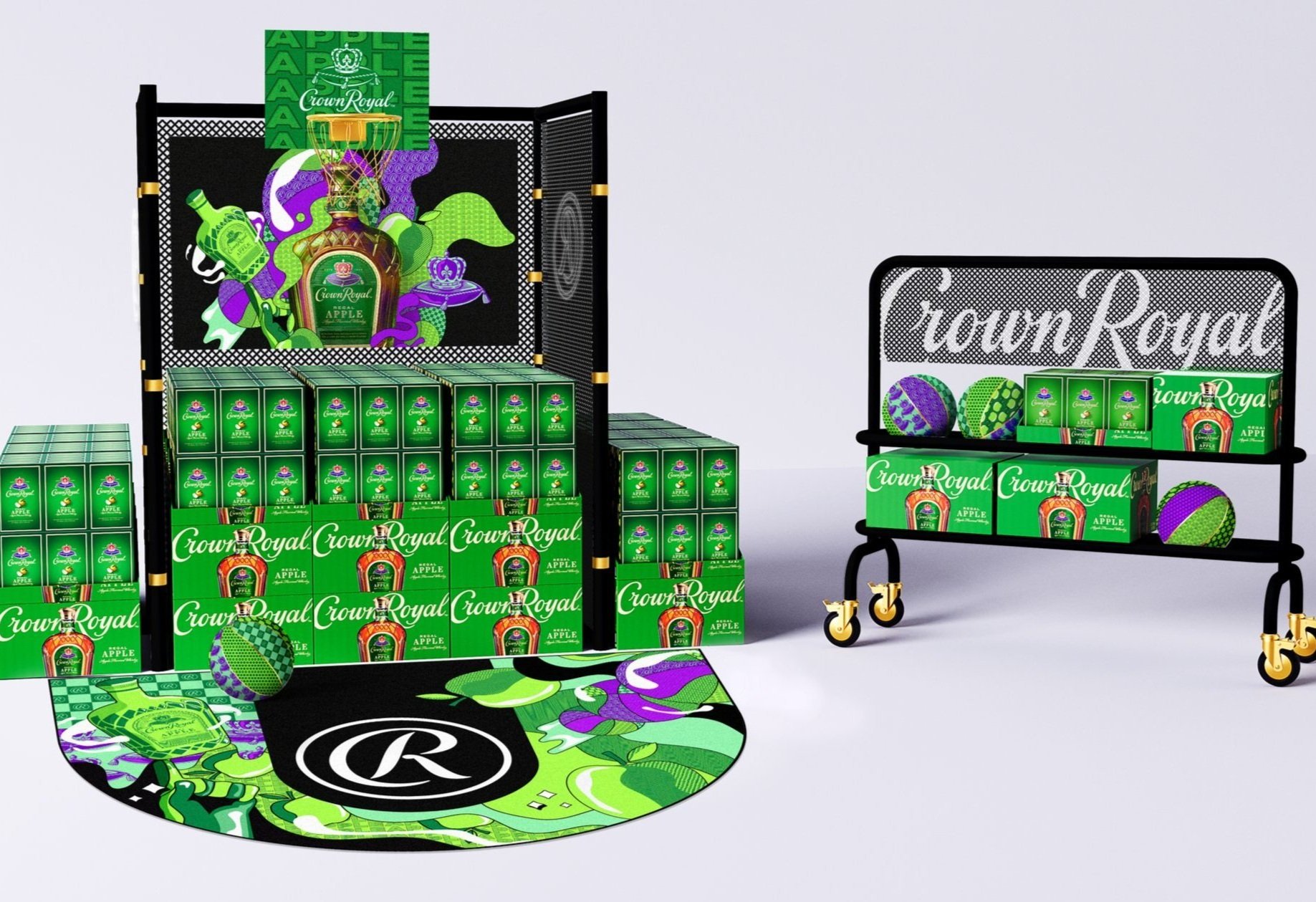
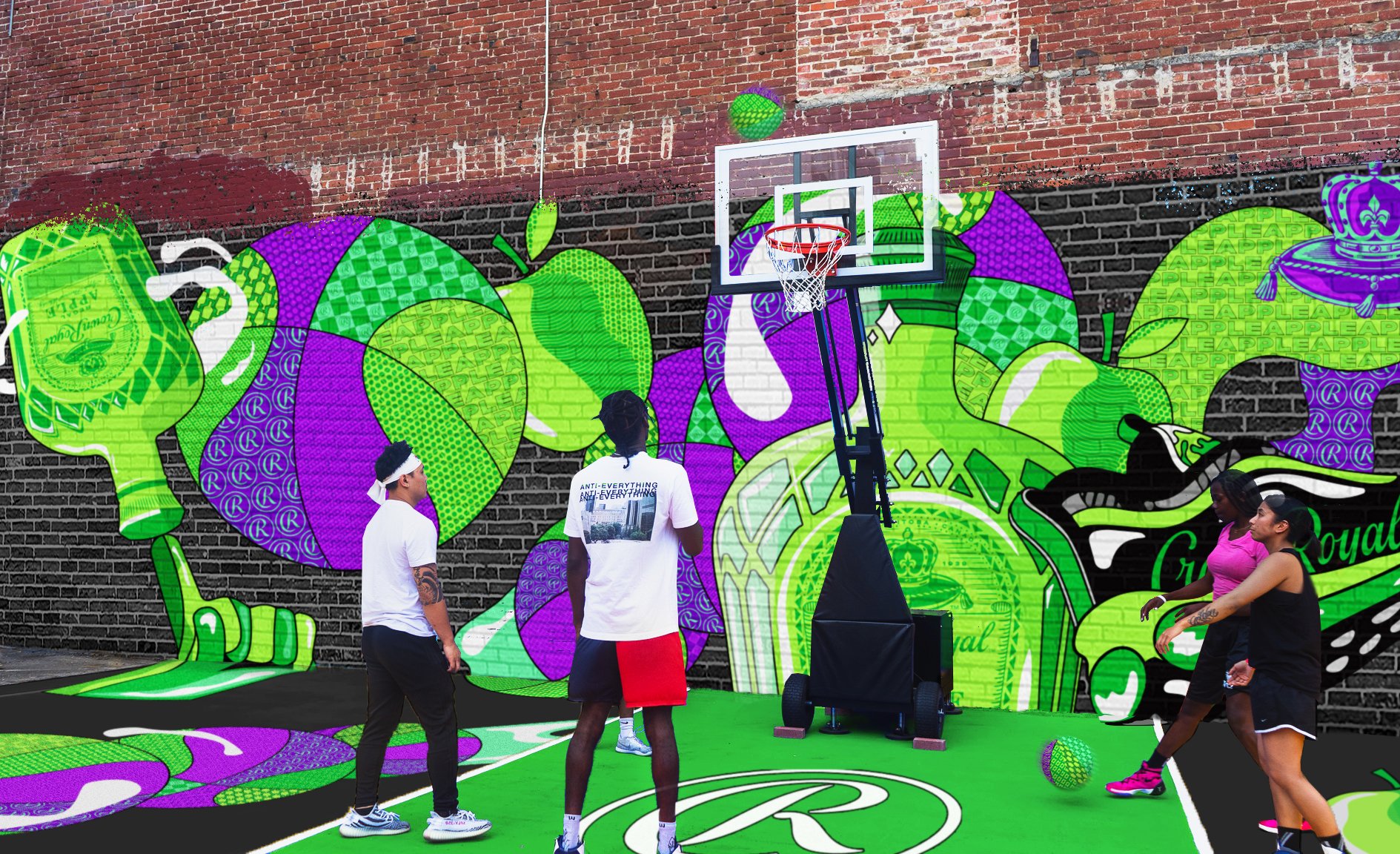
The visual system for Crown Royal is rooted in the vibrance of our Neo Luxe brand world. By blending sumptuous details, rich vibrance, and creative contrast, we developed a flexible system that reflects Crown Royal’s distinct style. The concept of Reframing Royalty emerged as a way to foster creativity while maintaining cohesion through a fixed and adaptable framework. This system differentiates across key pillars—Fine De Luxe (core offering), Flavors (fun and expressive), and Higher Marques (premium space).
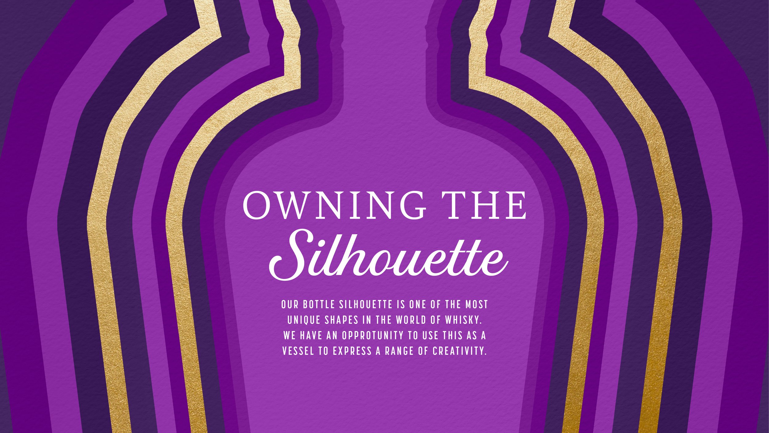
We also emphasized two key elements: the iconic Crown Royal bottle silhouette and the role of pattern in the Neo Luxe world. The bottle’s unique shape becomes a canvas for creativity, while patterns provide flexibility to express the brand across different pillars, from flavor to partnerships, ensuring cohesion throughout.




Disclaimer:
The graphics depicted throughout the Crown Royal case study, including photography and illustrations, may incorporate reference imagery strictly for inspiration purposes. All designs are original interpretations and do not intend to replicate or infringe upon any copyrighted material. Any resemblance to existing works is purely coincidental. This work is not affiliated with, endorsed by, or sponsored by any third parties associated with the reference imagery. If you believe any content infringes on rights, please contact us directly for resolution.